Monday, June 7, 2010

colour: grey

If Emily Strange had her way, every day would be grey.

Some sources of inspiration for my grey desires...  So many loves for grey!


My grey obsession started some time ago, and has been rapidly developing lately. Many of these pics below inspired me to start considering grey, and now suddenly I've been seeing it everywhere. I love how colours pop against a nice deep grey. (I've left out grey tile inspirations as I've already posted on that! Though new lovely pics may call for a follow-up bathroom grey post).


I've fallen hard for Abigail Ahern's design style after reading about her in Home Beautiful. *swoon*! I really want her book - you can find out about it at this page. Here are some pics of her work and other finds she has blogged about:


[from her 'interior design' website section - hot pink + grey = amazing!]


[also from interior design section on AA's website - bookcase wallpaper omg!]


[blogged by AA - a much warmer grey, but love the orange with it, though not really the white]


[blogged by AA]

I could definitely go on and on about Abigail and link to lots more of her images but I suggest just visiting her website and blog and spending your own time in the dreamy pictures! Ok one more.. 


[from AA's blog: Abigail's own desk - the raven is so Poe I want one immediately!]


Apartment Therapy has also feature a lot of lovely grey rooms lately:


[AT grey (American 'gray') bathroom special]


[originally from AT - this grey laundry is awesome against the red washer dryer]


[from AT: grey and orange is a winning combination]


[orig from AT I think - nice grey boards]
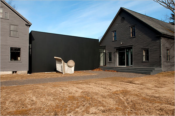

[from AT? this dark grey barn looking house with extreme modern extension (or is it just a black wall?) is awesome either way, definitely my taste in mixing old and modern styles]

I can't really remember where I sourced these pics but more grey is good...


[grey meets wood is nice]


[fat grey stripes! love]


[I see velvet... mmm velvet AND grey]


[grey, black and white with pops of yellow (white no good around the door tho)]


[love the colours in the artwork and how they really are supported by the grey wall. the decadent (almost kitchy) frames are good against the grey too - a bit of old and new]
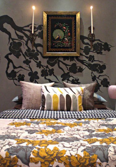
[grey and wall art - love]


[more grey and wall art, again the yellow/green looks good, though I don't care much for yellow myself]

.. and that was just a taste!

colour!

Have finally been able to get into my place to start work! Yipee! One of the first tasks I set for myself was to choose some colours and buy some paint. While a lot of work needs doing before I can even paint (like patching, filling etc, and work that just has to be done first) I wanted to have some colour on hand to give myself some inspiration! After tormenting myself with swatches for weeks, I ended up just choosing two colours in a bit of a rush as the paint shop was closing when I got there. Hey, nothing is permanent and no matter how much effort you put into colour picking (via swatches) you just have to get some colour on the walls to see how it functions in your space. Colour can change so easily, it's freaky at times! Contrasted against other colours, in a dark or light room, the colour can look very different - I've had greys go green, greys go blue, purple go green, white go yellow, and a host of other strange and at times frustrating results. So getting colour, some colour, ANY colour, in the space was a top priority.

For the interior walls I wanted a midtoned grey. I enjoy living with the Colourbond Dune and Wattyl/British Paints Hawk Wing in my current accommodations (not sure which brand that colour comes from... one of those two!). The Dune is quite a warm grey though (not quite brown) and I was tempted to go for a cooler grey for this house (not an actual cool grey, just a warm grey tending towards cool... nothing worst than a blue grey). The Hawk Wing is really nice, but I was unable to get a swatch (it has a cool name too, for the Wheel of Time fans out there :)). I ended up choosing Taubmans "Rock Quarry". It was one of the deeper colours in my swatch short-list, and still quite warm for a grey.

So far, I've only splashed paint in one room and a couple walls in the hall way. The Rock Quarry is on both the light and cool side of my initial intentions. I got the paint from Solver paints, so it will never be a true match to the proper Taubmans colours but Solver is better paint and cheaper too. The colour has come out slightly lighter than the swatch, definitely not as deep as I could possibly go. It also is a cool grey! Not quite steely, but certainly not very warm. That said, I quite like it, but I'm still uncertain how grey grey I want to go (as opposed to a warmer grey) - I've seen lots and lots of beautiful grey rooms on the internet and I think the grey grey is more forward looking and modern. OK enough tribulations; the jury is still out on Rock Quarry. I only got 10 litres so looking forward to getting more areas painted and seeing how it looks, especially in the kitchen/dining.

A sneak peak of the hall way painted in TB Rock Quarry (colour repro not the best due to using camera flash):


I don't think the white trim on skirtings and architraves is going to work for this look! Moody grey is interrupted by cheery white. Looks cheap and boring to me.

Another sneak peek, this time of the lounge. Notice how the polished jarrah works really nicely against the grey. Still think it might be a bit light.. but the carpet is up and the jarrah floor boards are to be polished, which adds weight to the room and a darker grey may be too much (ha! I don't really believe that). The picture rail and above are in 25% DX Lime White. I'm not sure about the white above the picture rail, but it's a hell of a lot easier if done that way (and easier to change the paint colour later too), so for now it stays (edges are rough as the ceiling was still wet and there was overspray onto the walls).


The ceilings are 25% Dulux Lime White. You really can't beat DX Lime White, it's a tried and true classic that my family has been using for years. It is rather creamy in full intensity, but diluted to 25% it is the perfect ceiling colour. Makes every colour I've seen next to it really pop. Low sheen, of course. Nothing worse than matt ceilings - ever tried wiping dust or dirt from matt paint? It'll mark like a mofo.

For the exterior I've chosen Wattyl Thunderbolt. It's a pretty deep grey, warm-to-green tinged. Been too busy on other more urgent tasks so haven't put any into action in, but I can't wait to see what it looks like!

exterior: a verandah roof in "haint blue"

Just stumbled across this neat idea, from Apartment Therapy - painting the ceiling blue! Seems as though it is a traditional thing to do in the USA, especially on porches, as documented in the post "Painted Ceilings of the South",  but the idea is extended into interiors as well, see "Outside In: Blue Ceilings". Some nice examples:


[images from the above posts at AT]


Now, I'm not a huge fan of blue in general - there are some shades I LOVE but there are just so many shades of blue and many of the examples you come across day to day are quite awful (think Glad lids, blue plastic cups, office furniture... *shudder*). Duck egg blue, Tiffany blue, the blue of our formal lounge dining in the house I grew up in, I like those blues. So the use of a really nice blue on the ceiling of my verandah could really work. It'd have to be a slightly dirty, slighty green-tinged cool blue, and would need some serious intensity and depth - nothing namby pamby, given the deep grey I have chosen for the walls.

Wednesday, May 26, 2010

lounge: design ideas

For the lounge room I have some ideas that have been nicely implement in this room as seen on Apartment Therapy - a New York-esque space, with full length sheer curtains along an entire wall, grey walls (I'll be going darker than in this example), black framed prints, wood floors, and grey/black shag rug. A nice mix of textures.


Monday, May 24, 2010

exterior: front window ideas (2)

Second window-strengthening-treatment idea is reliant on paint, possibly including mouldings to add texture and depth. I like that the white window border in the second photo looks both modern and heritage, a throw-back to the render band.


[house in Perth]


[house in Shenton Park]

Friday, May 21, 2010

exterior: front window ideas

The front windows of the house are rather weak compared to the two large and prominent front gables. It may be necessary to perform some treatment around or below them to increase their stature.

One suggestions is to place a hefty feature below the window, such as these limestone features, seen around town. However the windows are probably too low for this exact treatment, but it could be incorporated somehow. Also, it's a little too Californian bungalow. I'm not a fan of the triangular shapes in the bungalow look, but a more squared off variant might work.


[pics of houses around town]

rooms: wall decorations

I just stumbled across this cool 'wall dot' of a deer in headlights by Australian designers Pony Rider. It is available for AUD$79 [order at https://ponyrider.myshopify.com/products/bambi-nights-wall-dot]. They say you can re-stick it up to 50 times. Very cool. Might order one soon!


On the topic of wall decorations that aren't paint or wallpaper, I also love some wall decals found on etsy by PillBoxDesigns. This nosferatu grabbing the couch cracks me up every time I see it:


while the bat tree, gothic window and lace up corset are also pretty cool: